
Introduction
Printerous is an online printing platform that empowers individuals and small businesses to print conveniently without the need to visit an offline print store
My Role
Led the website redesign by identifying issues, defining problem scopes, prioritizing tasks, designing solutions, conducting testing, and overseeing the implementation process. Redefined core user flows and ensured user interface consistency and scalability through the development of design systems.
Company
PT. Printerous Global
June 23 - Dec 9, 2021
Tools
Figma, Hotjar, Maze.

Background
Understanding the critical need for a site redesign
Aligned with the company's quarterly OKRs, which prioritize Supporting Commercial Efforts in Maximizing Revenue-generating Products, one of the key results was the revamping of the website. Initial data collection revealed that our site was significantly underperforming compared to competitors, as indicated by metrics from similarweb.com and Google Analytics.


99%
no shopping activity rate
27%
cart
abandonment
rate
39%
checkout abandonment rate
62%
bounce rate
Exploring Metrics
Analyzing user navigation on the Printerous website
Explored user interaction patterns using Hotjar to gather detailed data on how users navigate our product detail page. Through this process, we uncovered valuable insights into user behavior, which allowed us to develop initial hypotheses.

User Research
Deepening our understanding of users
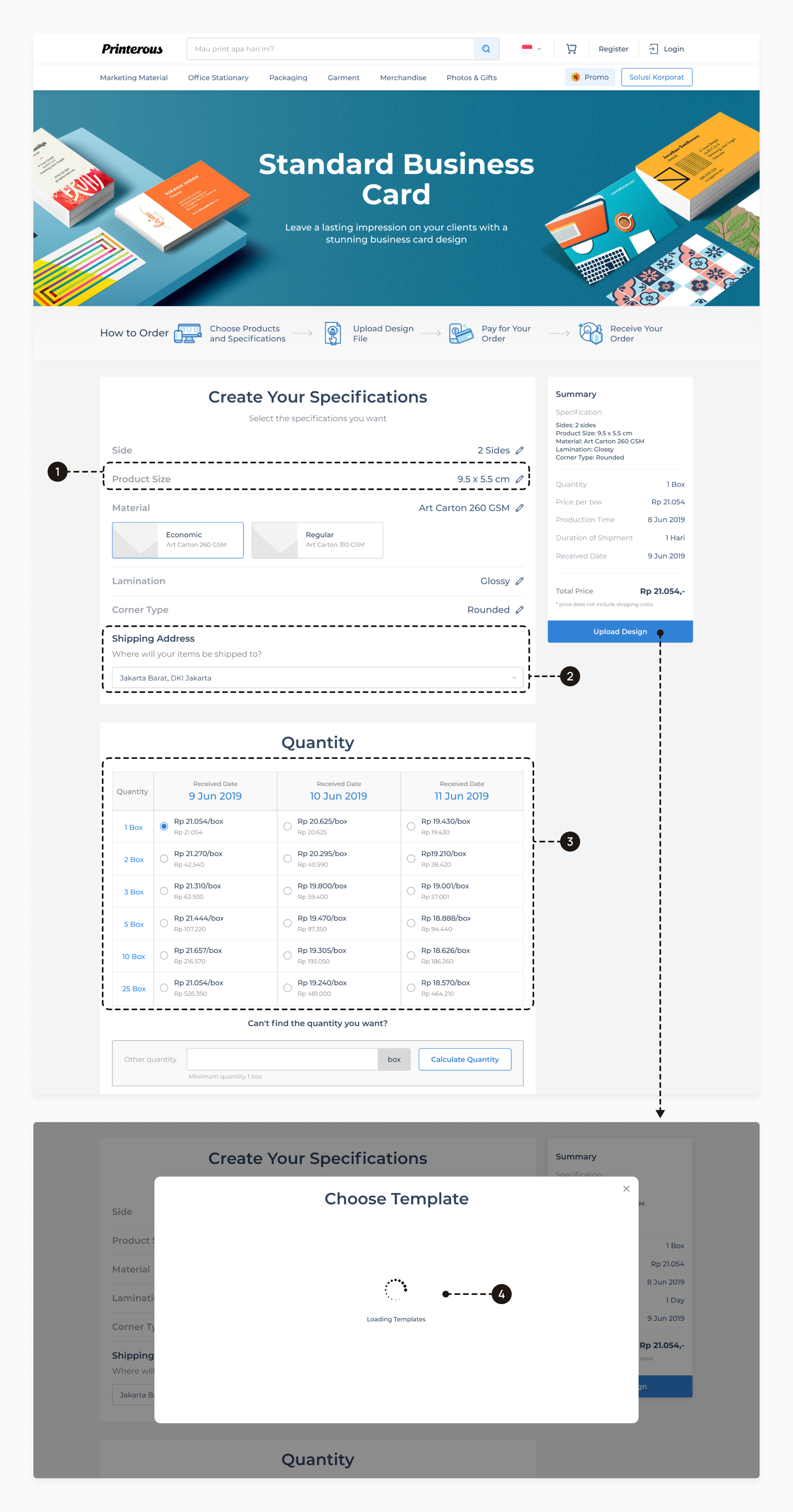
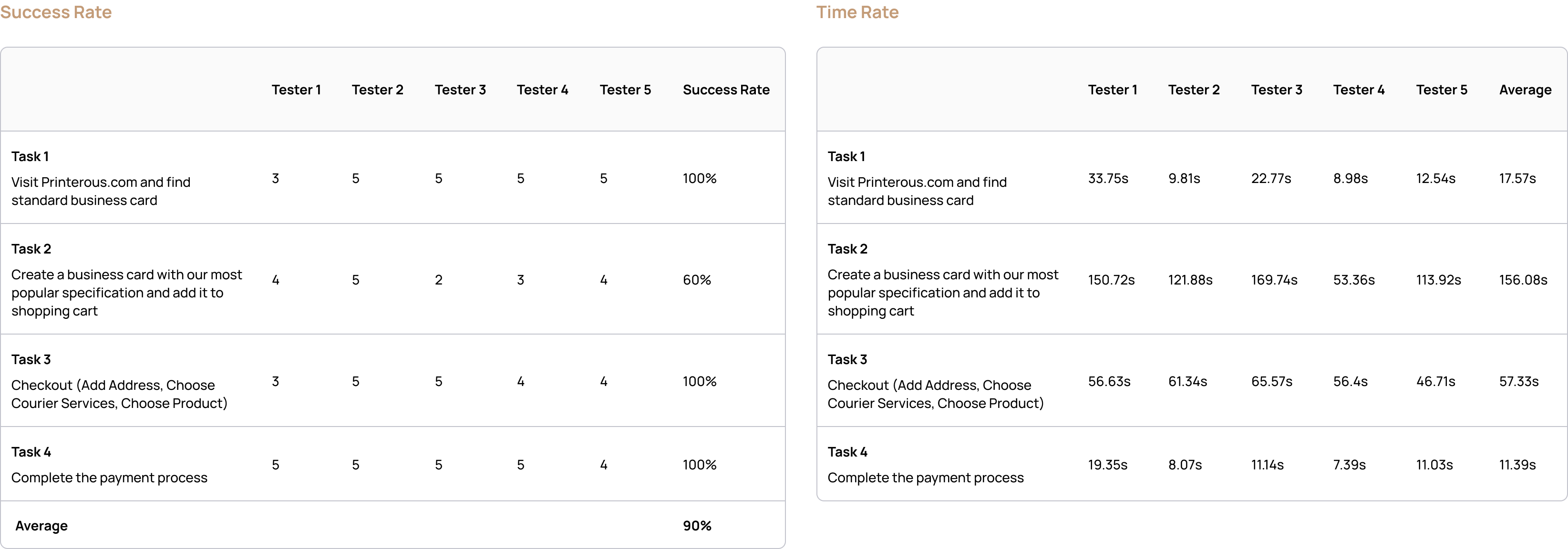
After reviewing sample recordings, I conducted evaluative research to confirm identified user pain points and validate our objectives. Our approach combined quantitative surveys for initial screening with qualitative phone and in-depth interviews involving 75 participants, providing detailed insights into user needs to guide strategic decisions.

Demographics
- A registered customer who has never made a purchase
- Male/Female between 21 - 35 years old
- Nationwide
Key Information Areas
- User background / profile
- Navigation patterns when browsing the Printerous website
- Users' needs, challenges and expectations throughout the ordering process
Research Insights
Unveiling key discoveries and insights
Through in-depth Hotjar analysis and user interviews, we identified significant issues that require immediate attention to enhance the overall user experience. These insights provide a clear prioritization of improvements for our platform to better meet user needs.
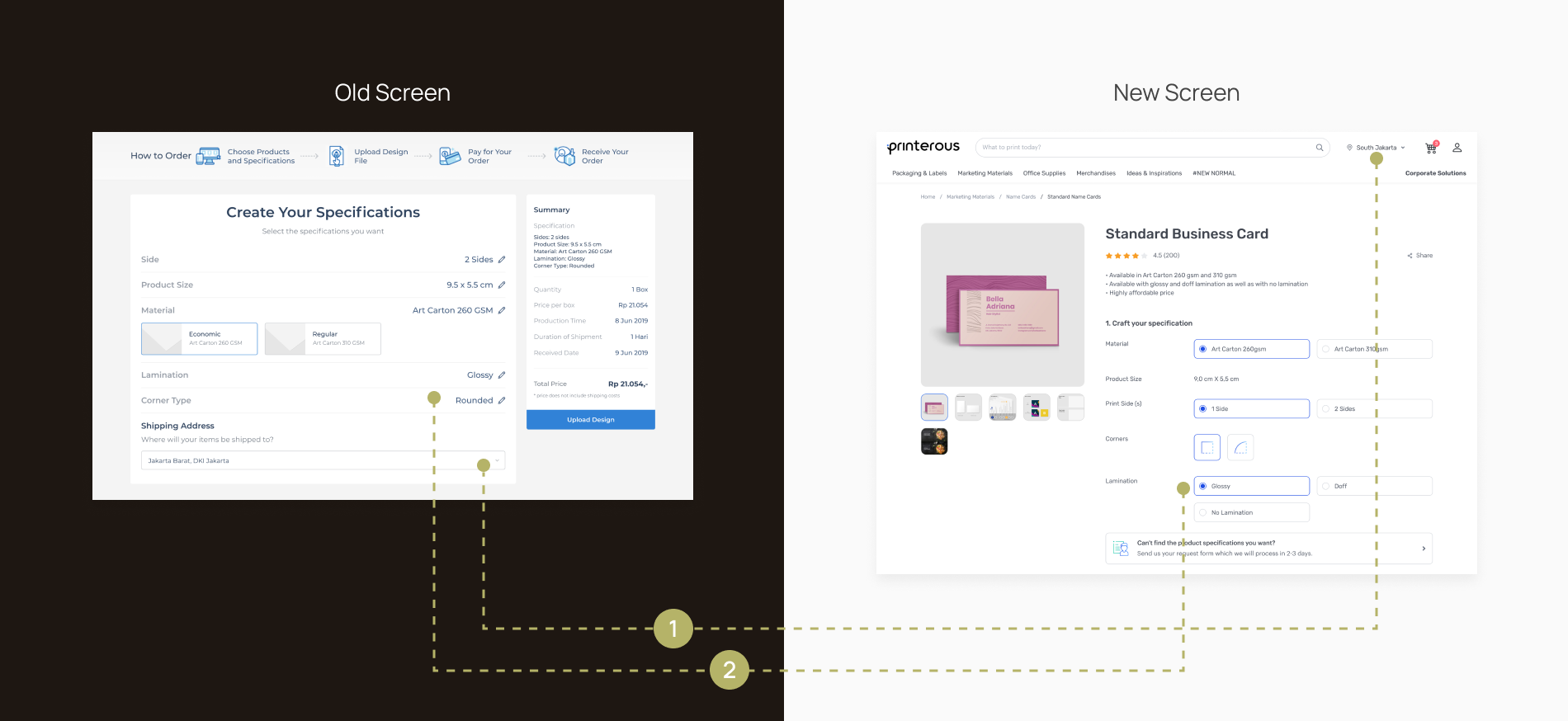
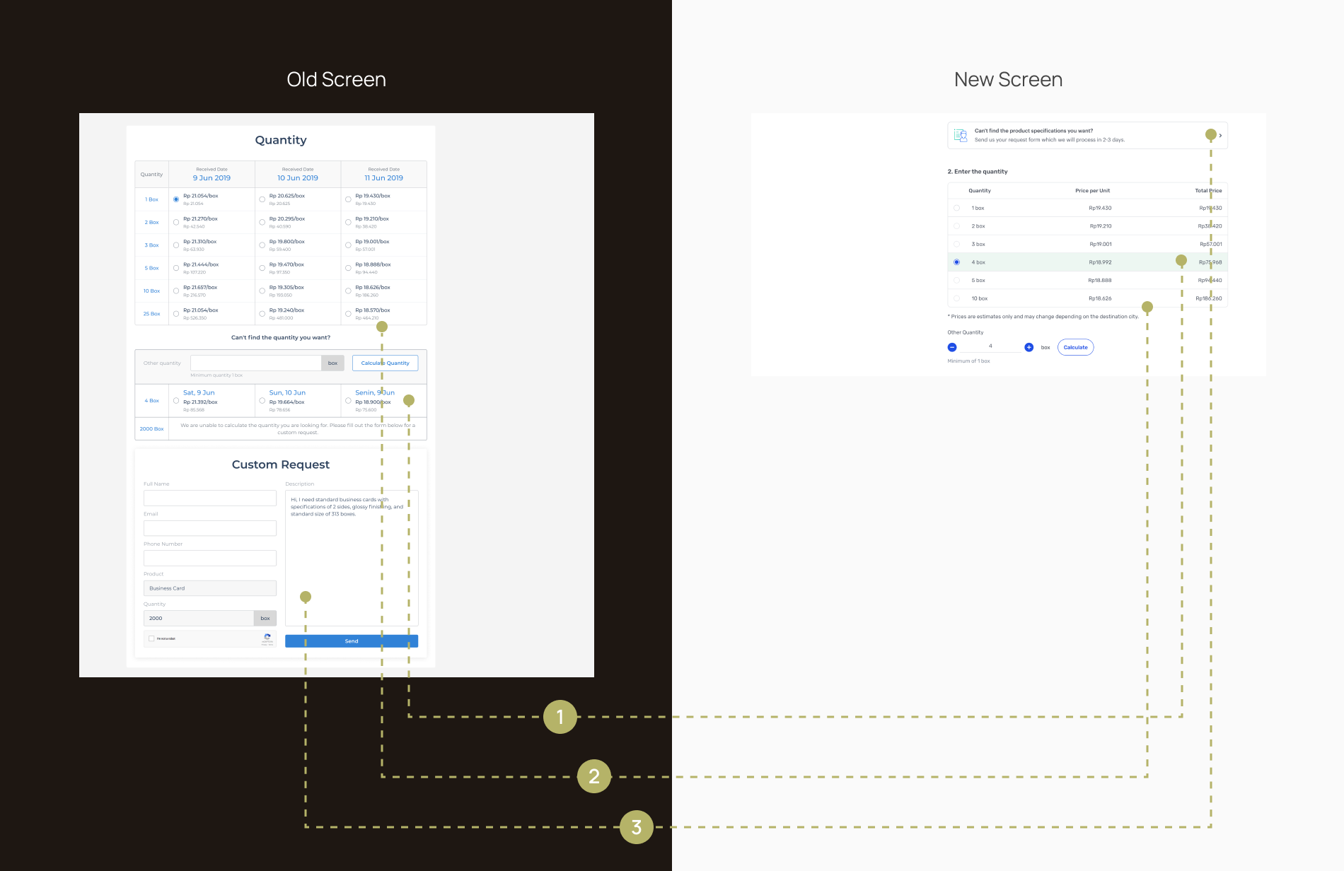
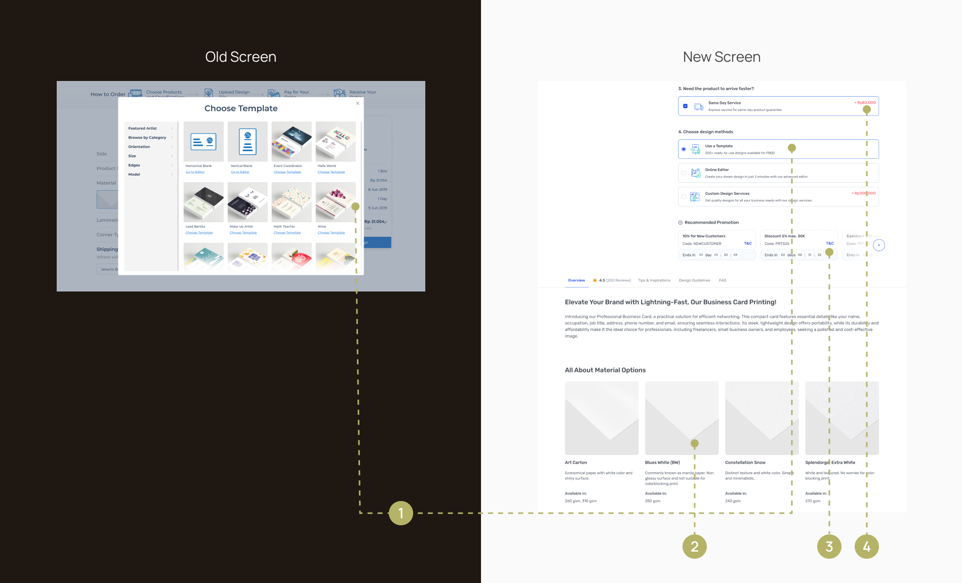
Examining the current experience, we pinpointed
specific areas that have consistently been user
pain points. Detailed explanations of these
problems are provided below.

01
Unfamiliar product customization style
When users first open the page and encounter a pre-selected option, they may wonder if they need to confirm their selection again. Additionally, the accordion style requires users to open each section to view all available options, creating an unnecessary step in the process.
02
Inappropriate context for elements
The shipping address is placed in the create specification section, even though it isn't part of the product specifications.
03
Data complexity
This table view might prompt various thoughts, including:
- Users may wonder about selecting alternative dates.
- The multitude of time and quantity options presents a broad array of choices, potentially slowing down decision-making processes.
- In certain cases, a higher quantity leads to a higher cost, prompting questions about the reasons behind this.
04
Design method as a roadblock to purchase
The extensive loading time for all templates creates a significant roadblock in the purchasing process. Users are required to wait for a large number of templates to load, causing delays. This prolonged wait time leads to frustration, prompting many users to abandon the process entirely instead of waiting for the templates to finish loading.
Design Goals
How might we provide a faster and frictionless experience for customers to create products by simplifying the customization steps so that it leads to increased conversion rates?
Customer Journey Map
Uncovering
new
opportunities
By diving into the user's perspective, allowing us to identify areas for improvement while aligning with our core business objectives.

User flow
Simplify the product creation process
We took a close look at the current user flow to see which step has room for improvement. By refining existing processes and making strategic adjustments, we streamlined the flow to eliminate bottlenecks and flaws, creating a smoother and more intuitive experience for users as they create their products.

Digital Wireframe
Wireframes enabling faster design iterations of the overall flow
Instead of creating multiple explorations, we opted for rapid prototyping and focused on iterating on a single wireframe solution to effectively manage tight timelines.

Brand Guidelines
Managing consistency across Printerous Platforms
In collaboration with a third-party branding agency, we undertook this project not only as a platform revamp but also as a brand refreshment initiative to give our company a fresh, cohesive identity. Printerous operates across multiple business lines, and previously, we lacked a unified design system, leading to inconsistent components and visuals across platforms. To address this, the UI/UX design team developed Prodigy, our first comprehensive Design System, ensuring uniformity and consistency across all our platforms.


Given our bright blue brand color and our focus on both digital and print media, we faced unique challenges. Print materials often look different due to color variations in CMYK printing. To address this, we carefully considered CMYK specifications for our print assets while maintaining consistent RGB versions for all digital assets.


Recognizing the extensive components required for our design system, we organized Prodigy into three distinct file categories to maintain clarity and efficiency.
- Foundations: This category includes elements such as typography, spacing, shadows, grid systems, and other fundamental rules that seldom change.
- Main Components: Following the atomic design methodology, we divided components into atoms, molecules, organisms, and templates for scalable and modular design, facilitating easy updates and maintenance.
- Graphic Library: This library comprises banners, iconography, illustrations, and product images.
Accessibility was a key consideration throughout our design process. We accounted for various accessibility needs, including color vision deficiencies such as protanopia. Additionally, we ensured our designs adhered to the Web Content Accessibility Guidelines (WCAG) 2.1 Level AA, reinforcing our commitment to creating inclusive and user-friendly experiences.
Design Outcomes
Issue 1 & 2
Unfamiliar product customization style & inappropriate context for elements
I explored established printing platforms to learn how they display product customization effectively, then adapted these strategies to fit our platform's context.

- Automatically define locations using Google Geolocation or specify them to certain areas without requiring user input.
- Implement a more familiar e-commerce product customization style.
Issue 3
Data complexity
Search for ways to create a simpler table that highlights only the most important data for users

- Custom quantity include in the first table eliminate the separation table.
- Simplify the data presentation on the table for easy understanding.
- Ensure custom inquiries are readily accessible on the page, allowing users to click the button if their desired specifications are not available, unlike in the old design where it only appeared for unfulfilled quantities.
Issue 4
Design method as a roadblock to purchase
Users are not required to wait for the templates to load; instead, they can directly proceed to the page based on the design method they choose.

- Choosing a template is not mandatory; it is offered as an optional design method for users.
- Inform customers with product knowledge such as material, thickness, lamination etc. for faster decision-making.
- Promotions related to the product are displayed directly on the page, eliminating the need for users to visit a separate promotions page.
- Introduced a value-added service (VAS) for expedited delivery options if users need their products faster.
User Testing
Evaluating redesign success through usability testing
To gauge user satisfaction with our product, I conducted a usability test with the help of one UX researcher intern, involving five participants and gathering both qualitative insights and quantitative data to evaluate the success of our design improvements.

The testing yielded positive outcomes. The users who tested the prototype easily understood how to create product in the website and recognized its value. We observed significant improvements across all tasks, with a 90% success rate in completing the checkout process.
Final Prototype
Impact
Highlighting key
achievements
This project provided valuable learnings, allowing me to observe firsthand the significant business impact of our work. The achievements listed below reflect the positive outcomes and growth resulting from our efforts.
92%
reduction in average time to add a product to cart
74%
increase in average order value (AOV)
1.07%
conversion rate
1.4
from 1.7customer effort score (CES)*
57
from 23net promoter score (NPS)*
4.8
from 4.6customer satisfaction (CSAT)*

Key achievements from this project include:
- Secured Series A funding led by BAce Capital, AddVentures, GDP Venture, and Gobi Agung in 2020.
- The new e-commerce website sustained the company during the pandemic in 2021 when offline printing demand significantly decreased due to dine-in restrictions.
- Developed Design System from 0 → 1, boost the design team's productivity by 40%.
- Due to the significant impact I made on this project, I was promoted from Junior UI/UX Designer to Associate UI/UX Designer within two years.